Client: Position Projects
Industry: Construction and development
Looking at the final, polished designs in a folio it can be hard to appreciate the work and process that goes into it's creation. The following is an abridged look at one project from brief to first presentation to a client of two concepts.
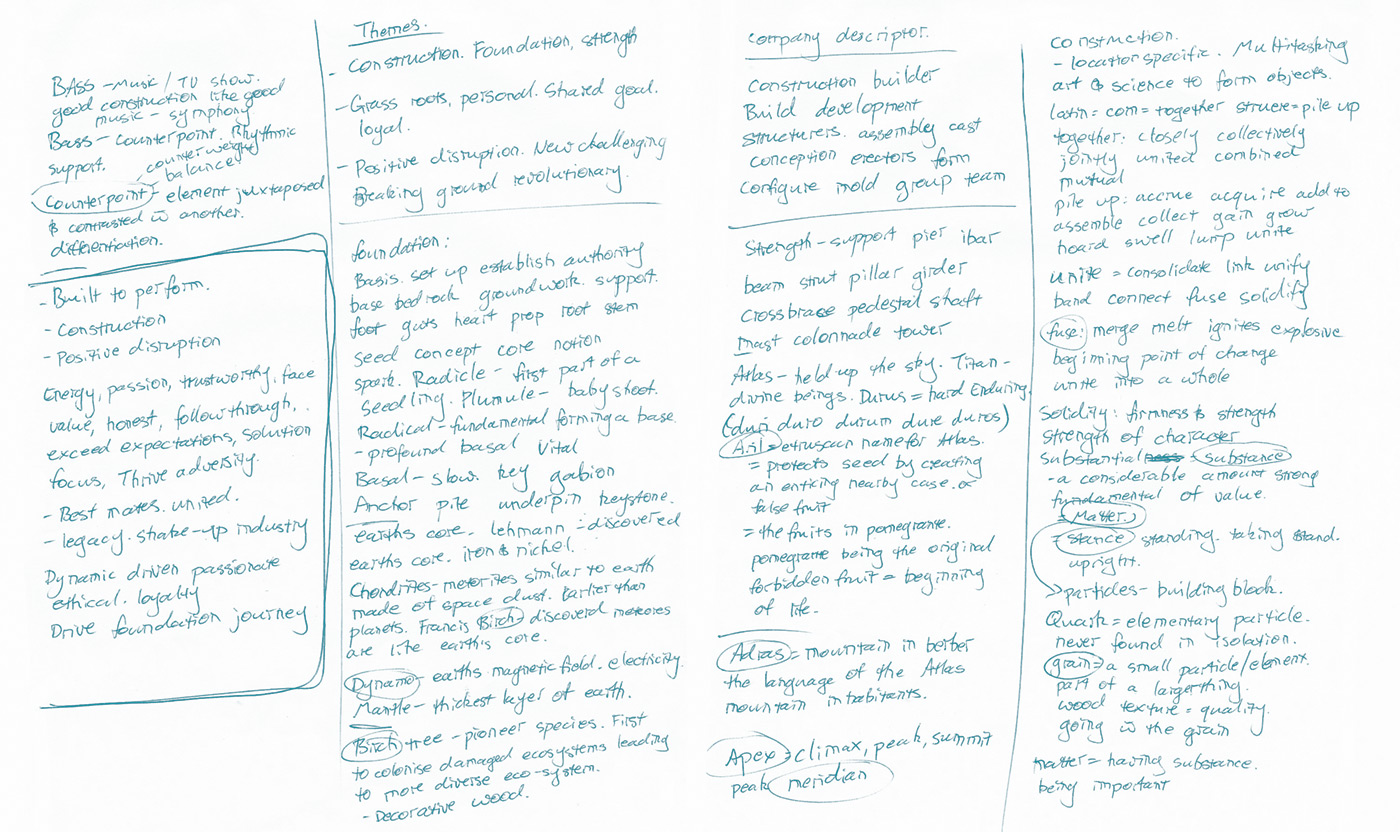
My clients required a brand for their new construction and development company that would positively disrupt the industry. The process began with research into the company and the industry, discovering the key values and drivers for all interested parties.
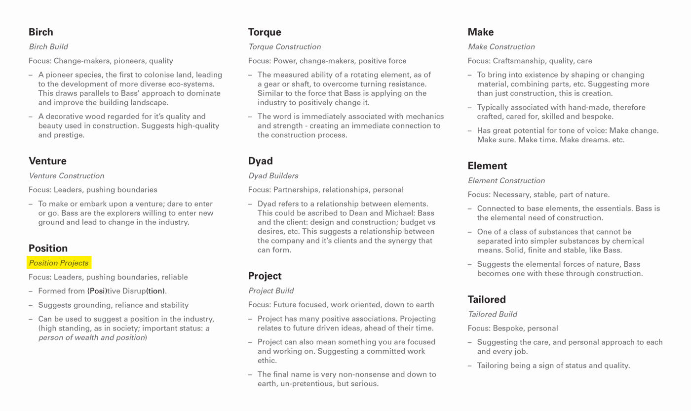
First we needed a name that could sum up the core values of the company. Research and idea development led to a short list. The favourite being Position Projects. Suggestive of high-standing and quality; industry leadership; drawing on their location specific, tailored projects.
The visual language explored themes such as passion, energy, perpetual motion, the un-expected, shifting balance, challenging the norm, breaking conventions, leading the way. Exploring many different ways to express Position Projects core values.
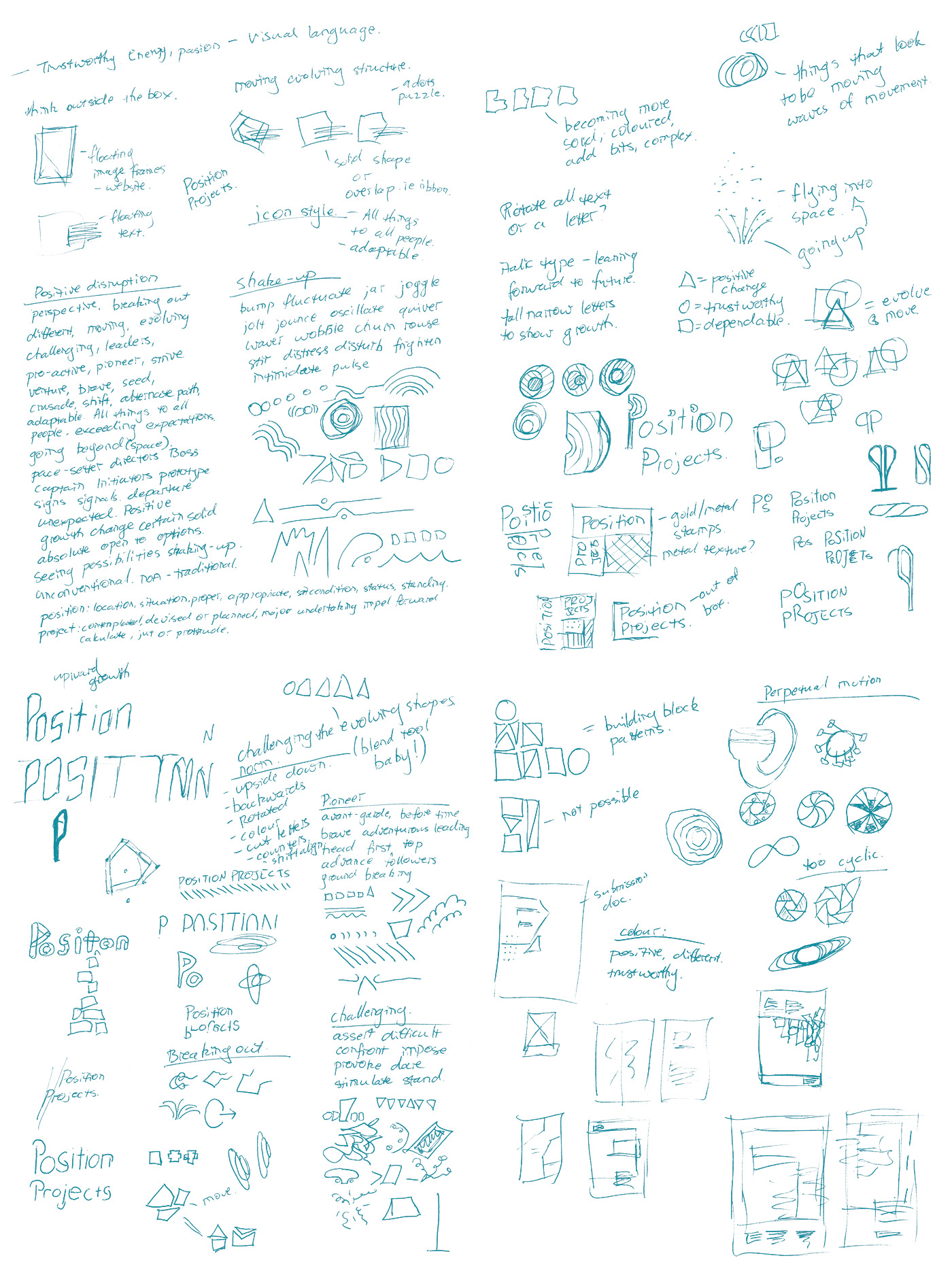
Keeping the scope of exploration broad, the stand out thumbnails were developed further digitally.
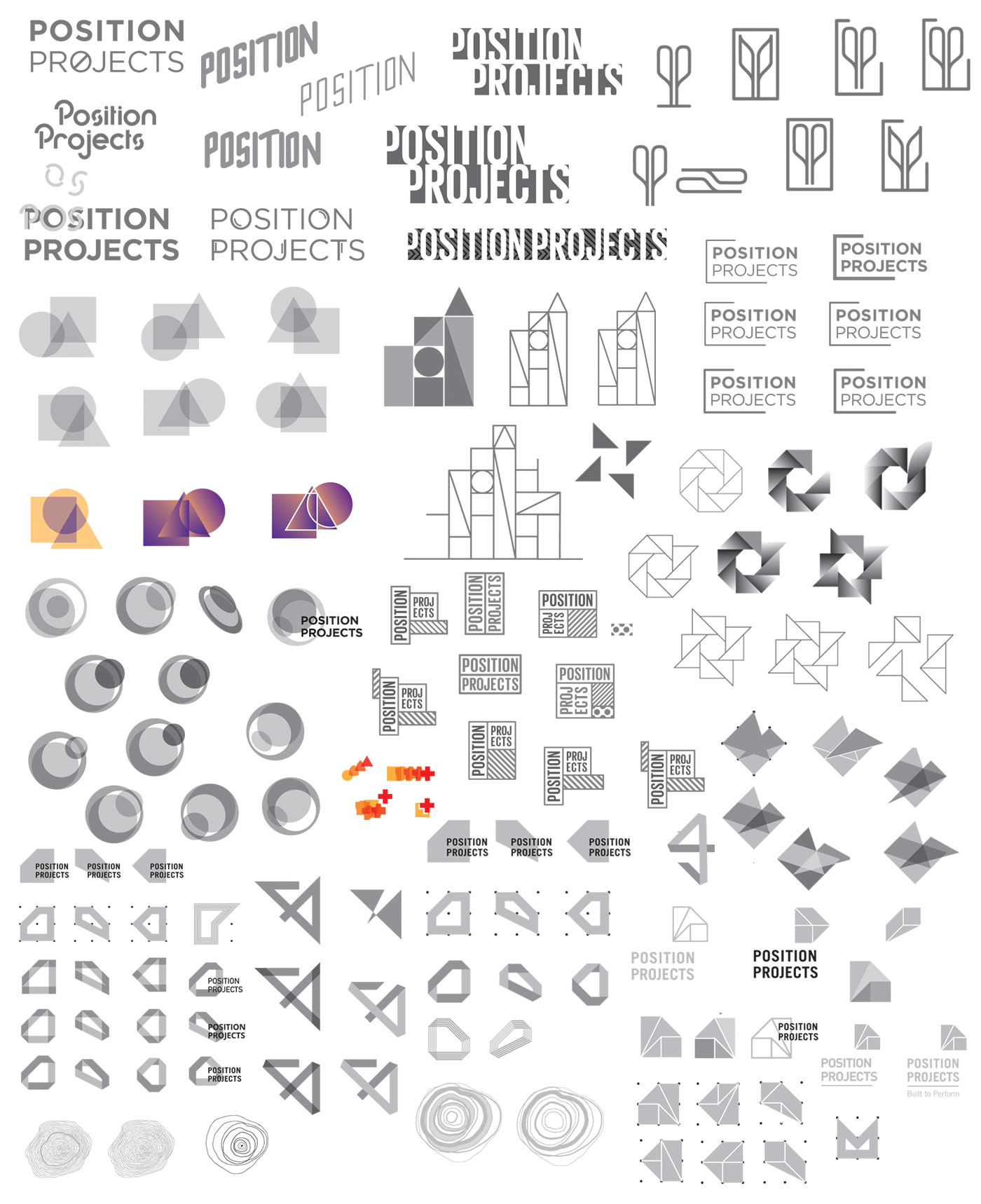
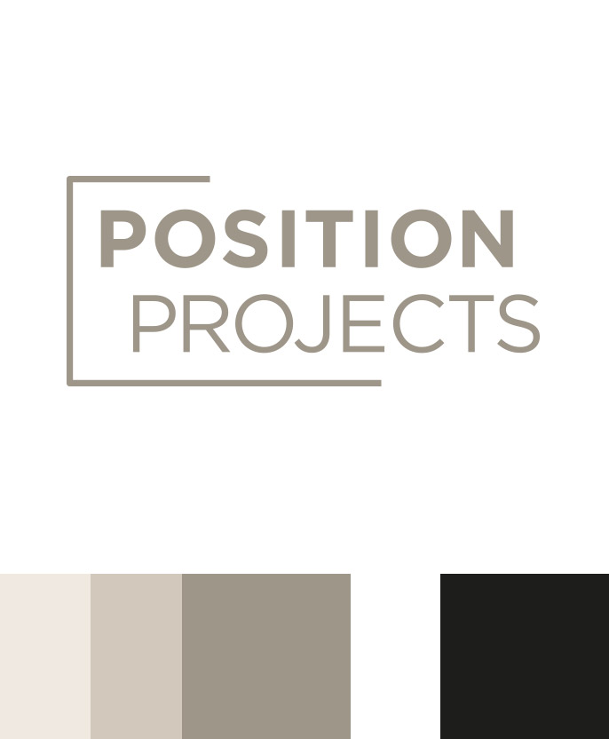
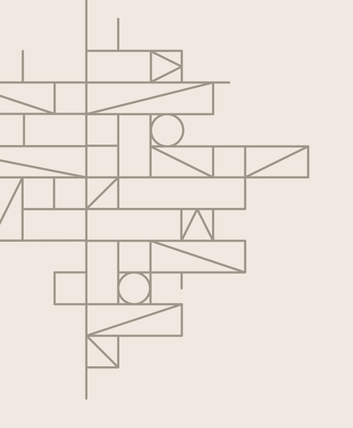
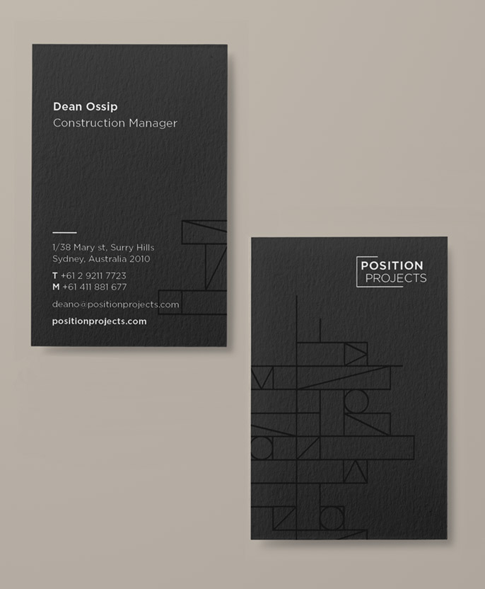
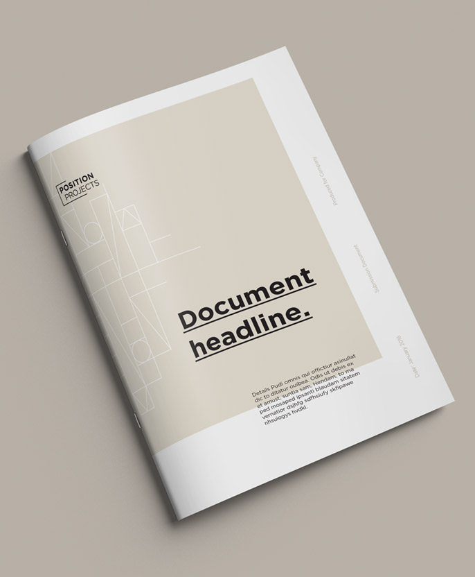
The first refined direction focused on the concept of breaking out of convention through construction. This drew on the visual language of Swiss Modernist design. Stripped to the foundations, structural, linear graphics are paired with neutrals tones.
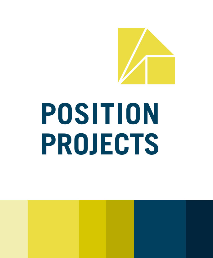
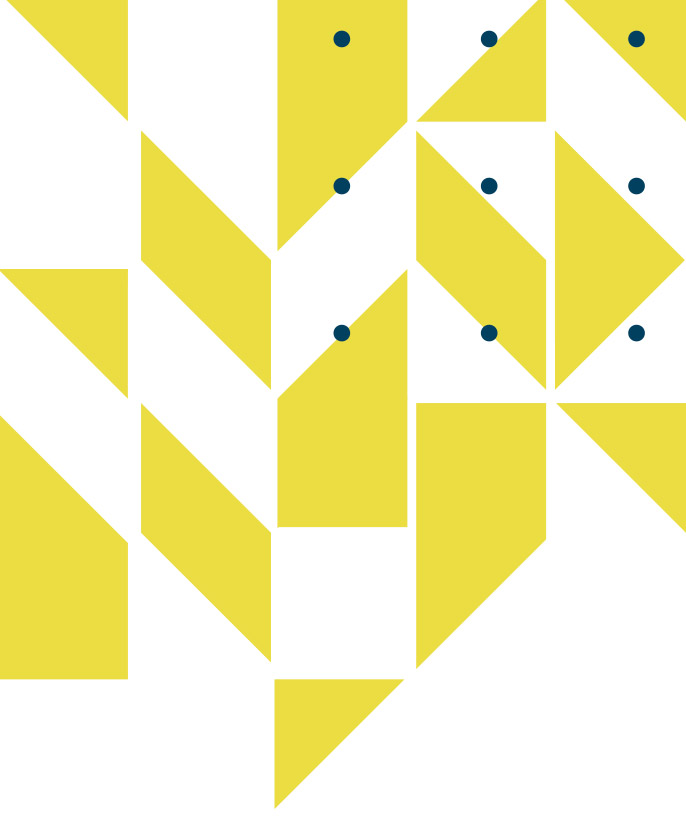
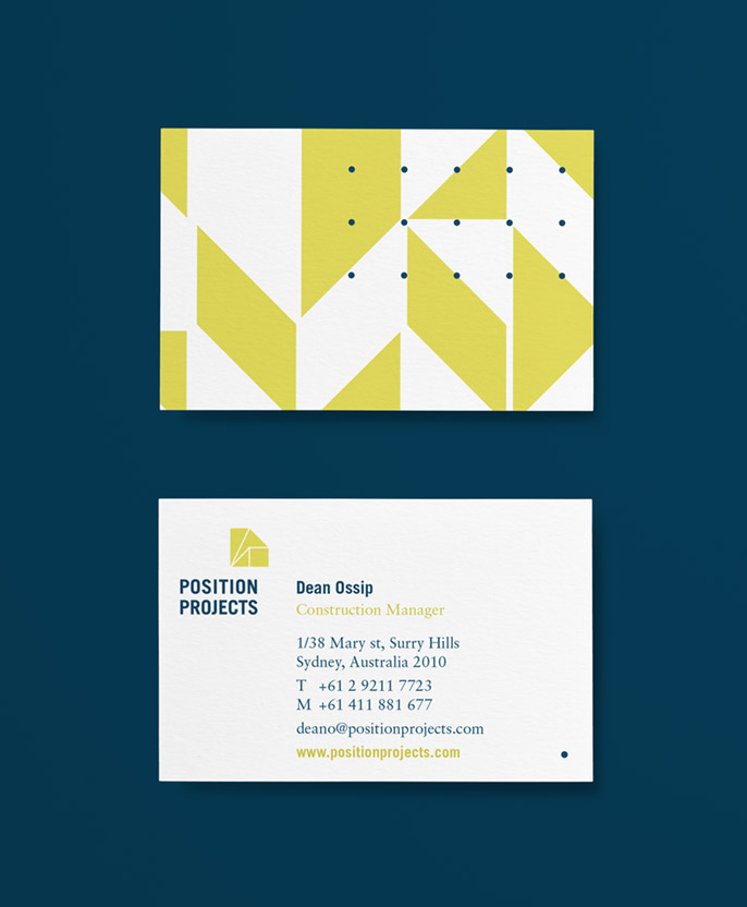
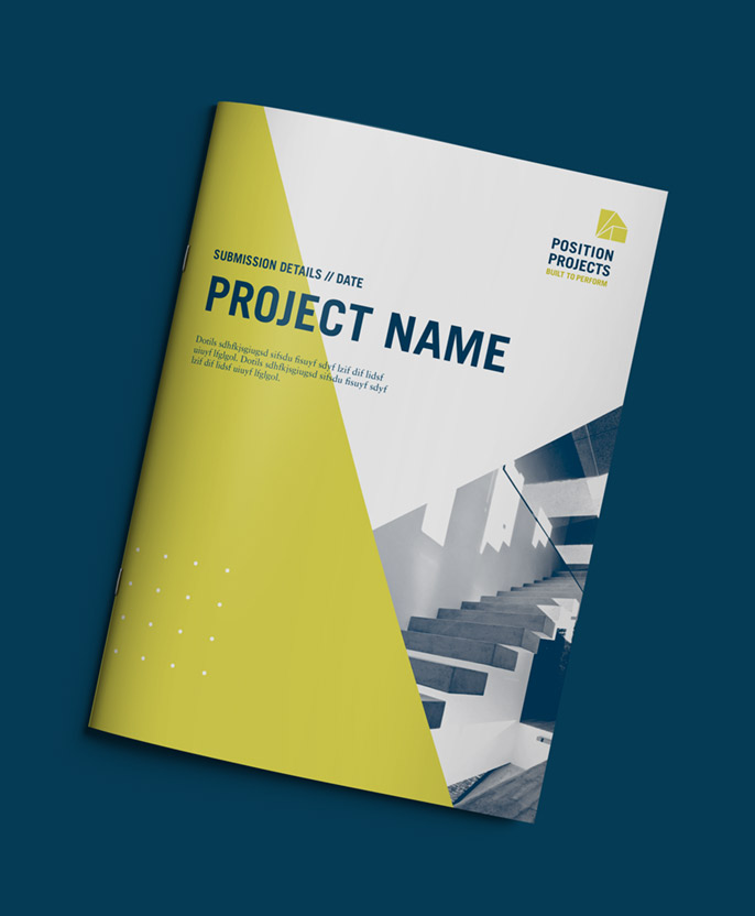
The second direction drew inspiration from evolution, growth and change. The initial form came from the nine dots puzzle - the birth place of the phrase "thinking outside the box". Bold, strong colours are paired with structural forms.