Client: ME Bank
Industry: Finance
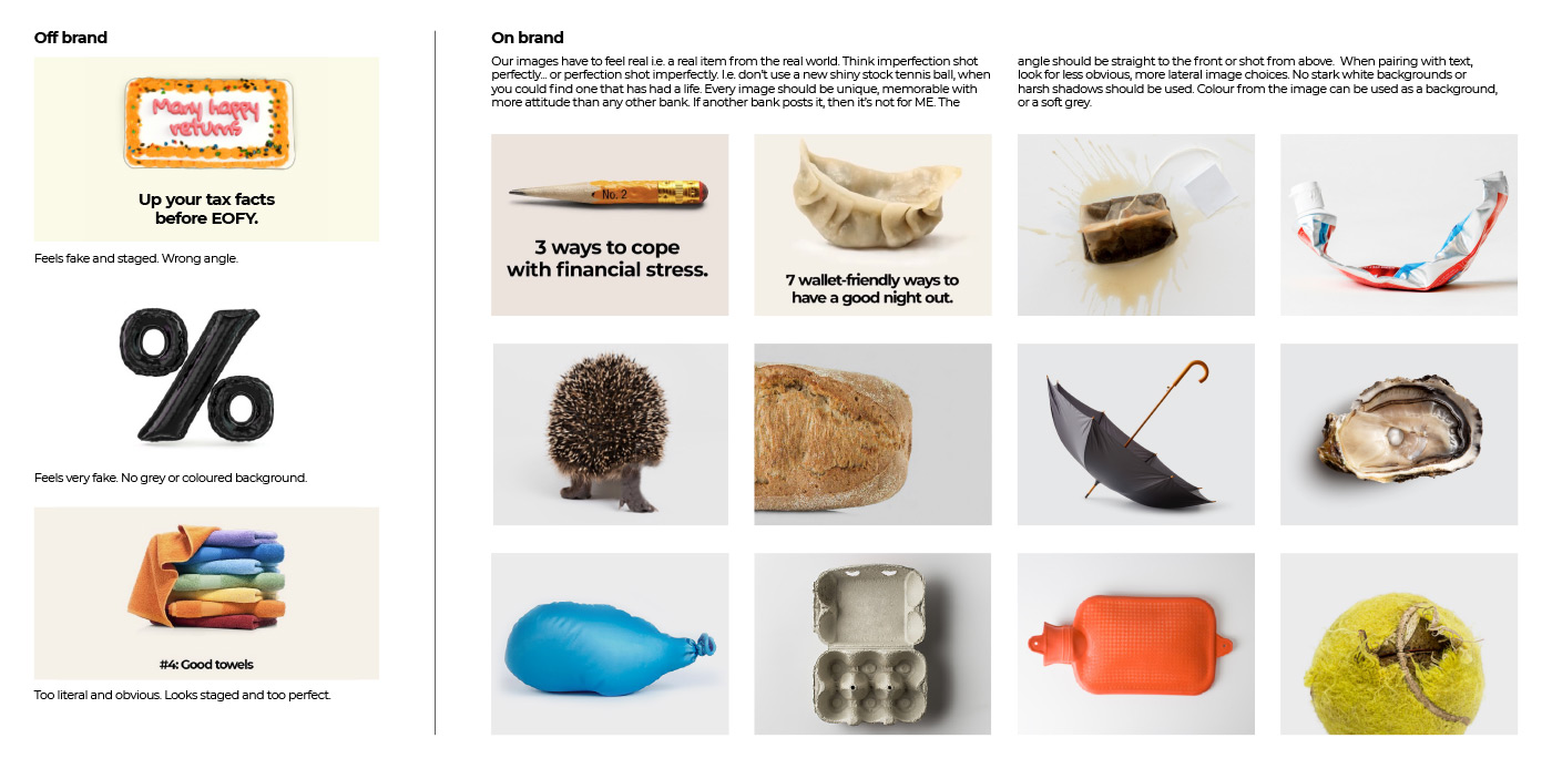
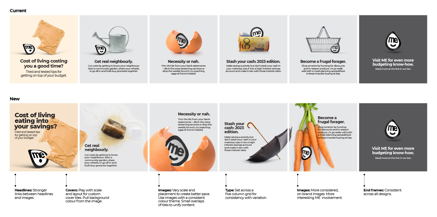
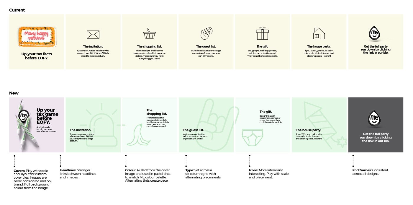
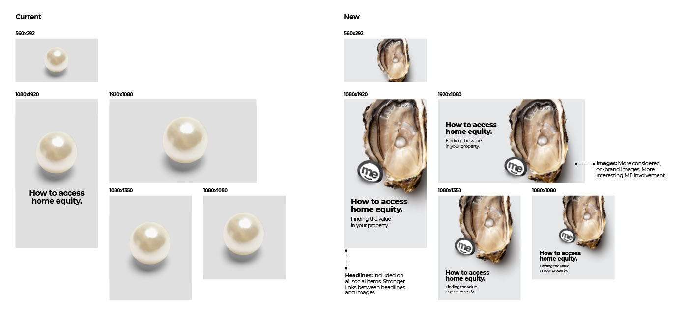
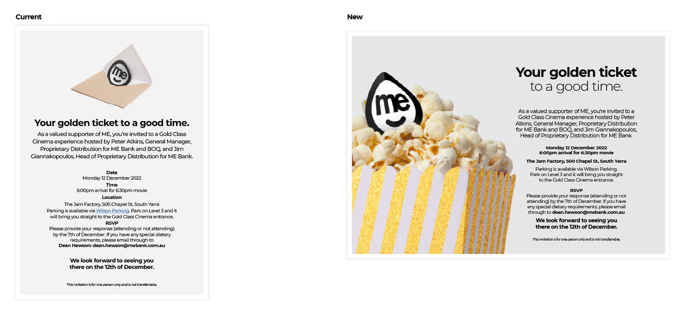
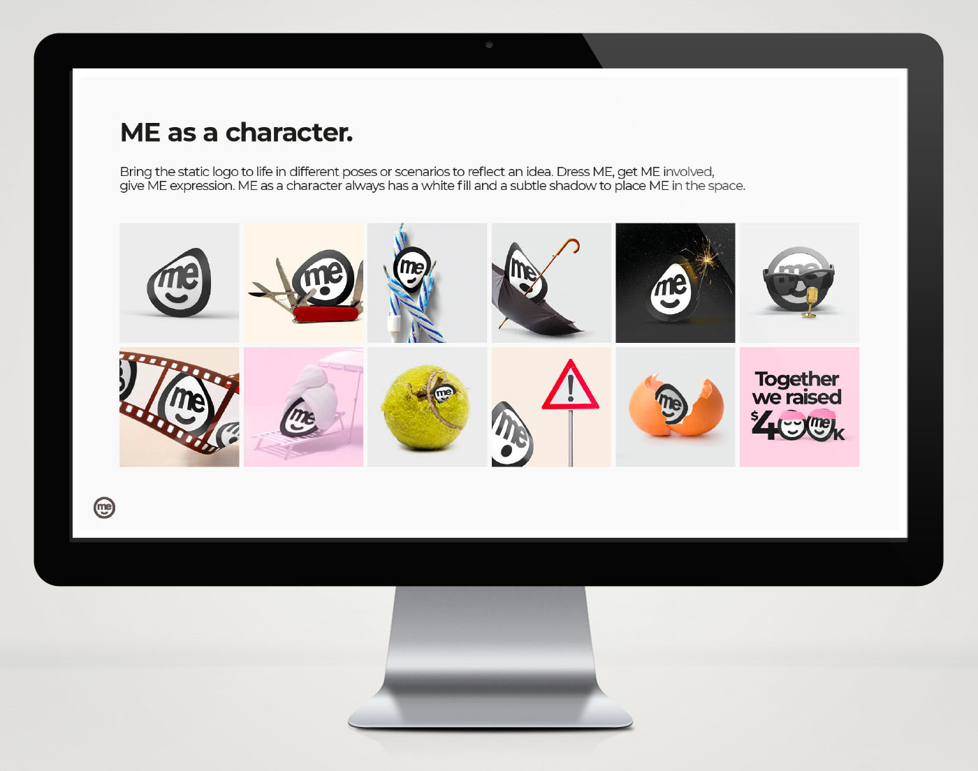
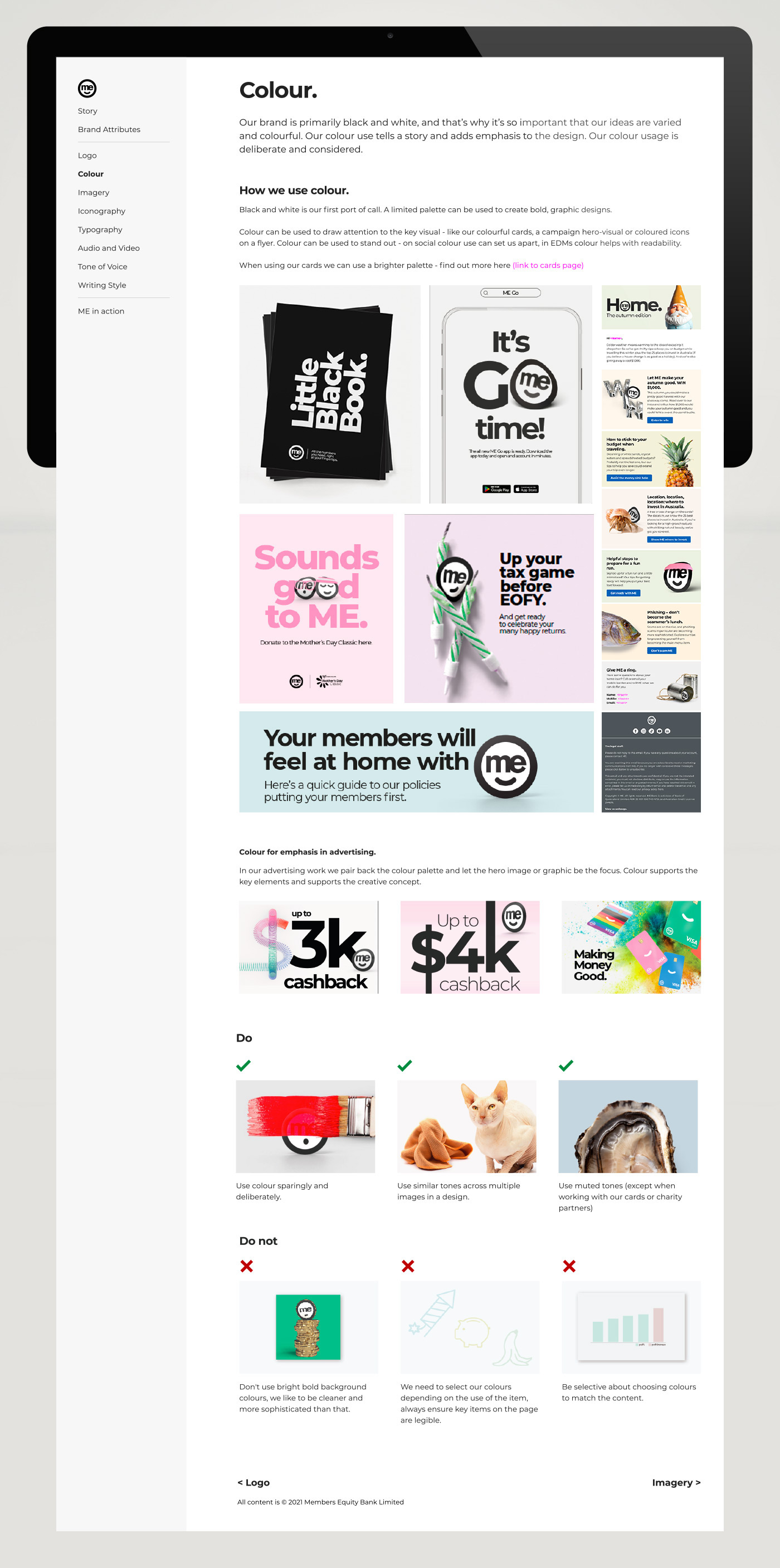
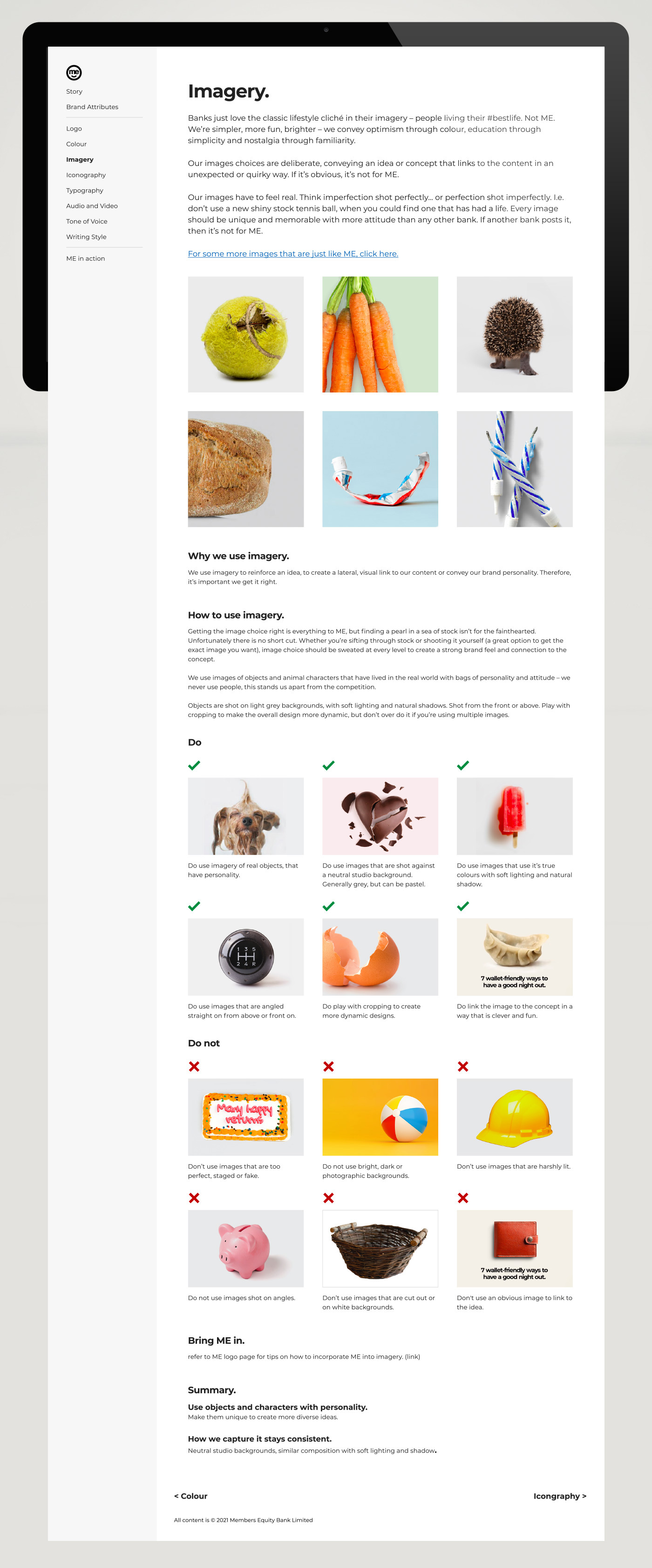
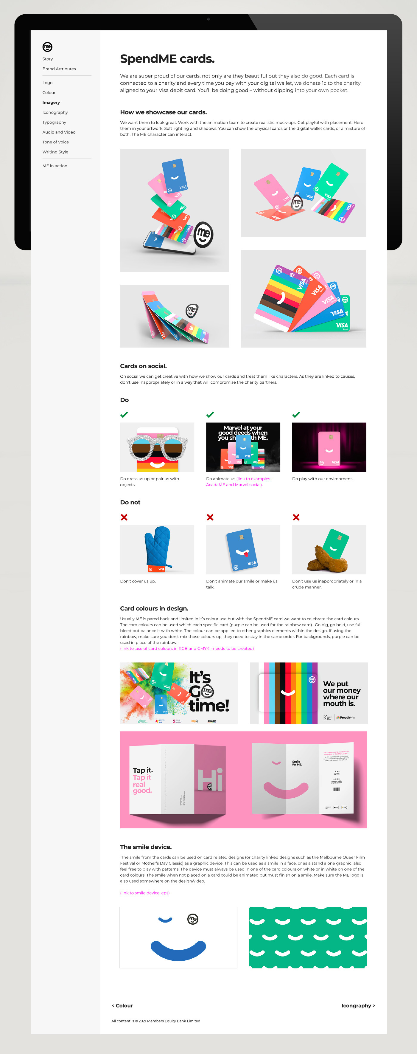
ME Bank has been playing it safe with their brand, too safe. As a disruptor and underdog in the industry it can afford to be different, shake things up and challenge the norms of the standard approach to financial branding. This refresh is a return to the true values of the brand Cool; Clever; Cheeky. The brand has a seemingly simple approach, but getting it just right takes careful crafting and consideration. Think imperfect objects, shot perfectly. Beautifully crafted typography. Smart headlines paired with considered imagery and a touch of wit.The refresh I have designed and the supporting guidelines, set the design team up to continue bringing life and fun to this brand.
